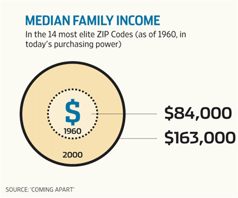
Believe it or not, the Wall Street Journal provides another example of an inaccurate circular graph. This time the error so closely parallels an example from Darrell Huff’s classic How to Lie with Statistics that I find myself wondering—intentional deception or innocent blunder?
The image above comes from Huff’s book. The moneybag on the left represents the average weekly salary of carpenters in the fictional country of Rotundia. The bag on the right, the average weekly salary of carpenters in the US.
Based on the graph, how much more do carpenters in the US earn? Twice? Three times? Four times? More?
The correct answer is that they earn twice as much, but the graph gives the impression that the difference is greater than that. The heights of the bags are proportionally correct but their areas are not. Because we tend to focus on the areas of shapes, graphics like this can easily mislead readers.
Misleading the reader, of course, was Huff’s intention. As he put it:
…I want you to infer something, to come away with an exaggerated impression, but I don’t want to be caught at my tricks.
What were the intentions of the Wall Street Journal this Saturday (1/21/2012) when it previewed Charles Murray’s new book Coming Apart?
In the published preview, Murray made a highly qualified claim—the median family income across 14 of the most elite places to live in 1960 rose from $84,000 in 1960 to $163,000 in 2000, after adjusting incomes to reflect today’s purchasing power.
Those cumbersome qualifications take the oomph right out of the claim. Too long to be a provocative sound bite, the Journal refashioned it into a provocative sight bite. Wow, those incomes really grew!
But not as much as the graph suggests. The text states that the median salary just about doubled. The picture indicates that it quadrupled. It’s Huff’s moneybag trick—even down to the relative proportion of salaries!
Here is a comparison of the inaccurate graph with an accurate version I constructed. The accurate graph is far less provocative.
As a rule, the areas of circles are difficult for people to compare by eye. In fact, using the area of any two-dimensional shape to represent one-dimensional data is probably a bad idea. Not only do interpretations vary depending on the shape that is used, but they vary depending on the relative placement of the shapes.
To illustrate these points, here are six alternative representations of Murray’s data. Which, if any, are lies?


